Color is one of the most powerful tools in interior design. Beyond mere aesthetics, the colors we choose for our homes can profoundly affect our emotions, behavior, and even our physical well-being. Understanding the psychological impact of different hues allows us to create spaces that not only look beautiful but also support our desired moods and activities.
In this comprehensive guide, we'll explore the fascinating world of color psychology in interior design, examining how different colors influence us and how to harness their power to create harmonious, purposeful spaces in your home.
The Science Behind Color Psychology
Our response to color is both physiological and psychological. Colors can:
- Trigger measurable physical reactions, like changes in blood pressure, pulse rate, and respiration
- Evoke specific emotional responses and memories
- Influence our perception of space, temperature, and time
- Affect our productivity, creativity, and sense of well-being
These responses arise from a complex interplay of evolutionary adaptations, cultural associations, and personal experiences. While some color responses are nearly universal (like the calming effect of certain blues), others vary based on cultural context and individual preferences.
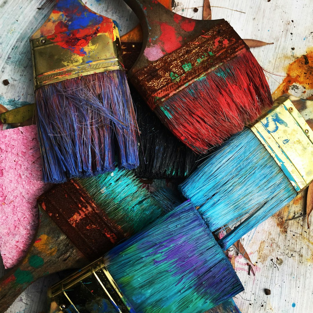
 A color wheel showing the psychological associations of different hues
The Emotional Impact of Colors
Let's explore how specific colors tend to affect our emotions and the spaces where they work best:
Warm Colors: Energy and Stimulation
Red
Psychological Effect: Stimulating, passionate, energizing
Best For: Dining rooms, social areas where you want to encourage conversation and appetite
Design Considerations:
- Red raises energy levels and can increase heart rate and blood pressure
- It can make time seem to pass more quickly and spaces feel more intimate
- Use in moderation—too much can create feelings of aggression or overwhelm
- Consider terracotta or burgundy for a more sophisticated, less stimulating alternative
Orange
Psychological Effect: Enthusiastic, playful, social
Best For: Exercise rooms, creative spaces, children's play areas
Design Considerations:
- Orange combines the energy of red with the cheerfulness of yellow
- It encourages communication, enthusiasm, and creativity
- More muted oranges like terracotta or amber create warmth without overstimulation
- Pairs well with blues (its complementary color) for a balanced, vibrant look
 A creative space using orange to stimulate imagination and energy
Yellow
Psychological Effect: Optimistic, uplifting, attention-grabbing
Best For: Kitchens, breakfast nooks, entryways
Design Considerations:
- Yellow is the most visible color and creates feelings of happiness and warmth
- It can enhance concentration and memory, but too much can create anxiety
- Soft buttery yellows are more soothing than bright, saturated yellows
- Effective for spaces that lack natural light or need a sense of sunshine
Cool Colors: Calm and Serenity
Blue
Psychological Effect: Calming, peaceful, trustworthy
Best For: Bedrooms, bathrooms, offices where focus is needed
Design Considerations:
- Blue has been shown to lower blood pressure and slow respiration and heart rate
- It can create a sense of space and tranquility
- Lighter blues are refreshing and airy, while deeper blues create sophistication
- Very pale blues can sometimes feel cold in spaces with little natural light
 A serene bedroom featuring calming blue tones for relaxation
Green
Psychological Effect: Balancing, refreshing, restorative
Best For: Living rooms, home offices, anywhere you want balance
Design Considerations:
- Green symbolizes nature and brings a sense of balance and harmony
- It's the easiest color on the eyes and can improve reading ability and comprehension
- Sage and olive greens create a sophisticated, timeless look
- Works particularly well in transitional spaces that bridge indoor and outdoor areas
Purple
Psychological Effect: Creative, luxurious, contemplative
Best For: Creative studios, meditation spaces, bedrooms
Design Considerations:
- Purple combines the calm of blue and the energy of red
- Historically associated with royalty and luxury, it adds sophistication to spaces
- Lighter lavenders promote restfulness, while deeper purples create drama
- Can be challenging to balance—consider using as an accent with neutrals
Neutral Colors: Foundation and Balance
White
Psychological Effect: Clean, fresh, spacious
Best For: Any room where you want to create a sense of space and light
Design Considerations:
- White symbolizes purity and creates a feeling of cleanliness and openness
- It reflects light, making spaces feel larger
- Too much stark white can feel clinical—consider warmer whites like ivory or cream
- Provides an excellent backdrop for other colors and textural elements
 A clean, spacious design using white with textural elements for warmth
Gray
Psychological Effect: Sophisticated, balanced, timeless
Best For: Living rooms, bedrooms, anywhere you want subtlety
Design Considerations:
- Gray is versatile and sophisticated, creating a sense of stability
- Warmer grays (with brown or red undertones) feel cozier than cooler grays
- Can serve as an excellent neutral backdrop for bolder accent colors
- Too much gray without texture or contrasting elements can feel flat or depressing
Brown
Psychological Effect: Grounding, natural, reliable
Best For: Living rooms, studies, spaces where you want warmth and stability
Design Considerations:
- Brown creates a sense of security and stability
- It connects spaces to the natural world, especially when used in wood elements
- Lighter browns like tan and beige are versatile neutrals
- Darker browns add richness and weight to a space
Black
Psychological Effect: Powerful, sophisticated, dramatic
Best For: Accents in most rooms, full treatment in spaces where drama is desired
Design Considerations:
- Black creates visual weight and can add sophistication
- It makes a strong statement but can absorb light and make spaces feel smaller
- Works best as an accent or in well-lit spaces with contrasting elements
- Particularly effective for creating definition and visual punctuation
 A room using black as a sophisticated accent to create drama and definition
Color Psychology by Room
Different spaces in your home serve different functions and can benefit from specific color approaches:
Living Room
As a multi-purpose space for relaxation and socializing, living rooms benefit from flexible color schemes:
- Versatile approach: Neutral base with accent colors that can shift the mood
- For energetic spaces: Warm neutrals with pops of energizing colors
- For relaxation: Cool neutrals with blue or green accents
- Consider: How the room is used at different times of day and by whom
Kitchen
As a hub of activity and nourishment, kitchens respond well to colors that stimulate or welcome:
- Appetite stimulation: Warm tones like red, orange, or yellow
- Clean, fresh feeling: White, soft blues, or greens
- Social kitchens: Consider warmer tones that encourage conversation
- Practical kitchens: Blues or greens can create a sense of efficiency
 A kitchen using warm yellows to create a welcoming, appetite-stimulating environment
Bedroom
For rest and rejuvenation, bedroom colors should promote relaxation:
- Restful sleep: Blues, lavenders, and soft greens
- Romance: Deeper purples, burgundies, or warm neutrals
- Morning energy: Consider how the colors will feel upon waking
- Personal retreats: Use colors that personally resonate with relaxation
Home Office
Productivity and focus are key considerations for workspace colors:
- Concentration: Blues can enhance focus and productivity
- Creativity: Greens, purples, or strategic yellow accents
- Energy: Thoughtful red or orange accents in otherwise calm schemes
- Balance: Consider the nature of your work when selecting colors
Bathroom
Both cleanliness and relaxation are important in bathroom color schemes:
- Spa-like retreat: Soft blues, greens, or lavenders
- Morning energy: Yellows or corals for a refreshing start
- Clean feeling: Whites and pale blues convey cleanliness
- Consider: Natural light levels—darker bathrooms benefit from lighter colors
 A spa-like bathroom using cool blues and greens to create a sense of calm and cleanliness
Cultural and Regional Influences on Color Psychology
While some color responses are biologically based, many are influenced by cultural associations. In Spanish design, for example, we see:
- Mediterranean influences: Terracotta, blues, and sun-washed whites reflecting the landscape
- Cultural heritage: Rich reds and golds from historical Spanish design
- Regional variations: Coastal areas favoring blues and whites, while inland regions use warmer earth tones
Understanding these cultural dimensions adds depth to color choices, especially when drawing inspiration from specific design traditions.
Practical Applications: Creating Color Schemes
Translating color psychology into actual design schemes requires some practical approaches:
The 60-30-10 Rule
A balanced color scheme often follows this distribution:
- 60% dominant color (often a neutral or more subtle hue)
- 30% secondary color to support the main color
- 10% accent color for visual interest and emphasis
This approach ensures harmony while providing enough contrast to keep spaces interesting.
Color Harmony Approaches
- Monochromatic: Different shades and tints of a single color—creates a cohesive, sophisticated look
- Analogous: Colors adjacent on the color wheel—harmonious and comfortable
- Complementary: Colors opposite on the color wheel—creates energy and contrast
- Triadic: Three colors equally spaced on the color wheel—vibrant but balanced
 Examples of different color harmony approaches in interior design
Light Considerations
The same color can appear dramatically different depending on lighting:
- North-facing rooms receive cooler light that can make colors appear more blue
- South-facing rooms get warm, direct sunlight that enhances warm tones
- East-facing rooms receive bright morning light but cooler afternoon light
- West-facing rooms get warmer afternoon and evening light
Always test paint colors in the actual space at different times of day before committing.
Transitions Between Spaces
Color can help create flow between rooms:
- Use consistent undertones throughout a home for cohesion
- Consider how colors in adjacent spaces will interact
- Create transitions by carrying accent colors from one room into another
- Use varying intensities of related colors to create movement through spaces
Common Color Mistakes and How to Avoid Them
Even with an understanding of color psychology, some common pitfalls can affect results:
Ignoring Undertones
Every color has undertones that may not be immediately obvious but affect how it interacts with other elements:
- Beiges can have pink, yellow, or green undertones
- Grays might have blue, green, or purple undertones
- Whites range from stark blue-whites to creamy yellow-whites
Solution: View colors alongside existing elements in your space (flooring, furniture, etc.) to ensure undertones complement each other.
Following Trends Without Consideration
Color trends come and go, but living with colors is a personal experience:
- A trendy color you don't respond to emotionally won't create the desired psychological effect
- Trend colors can quickly date a space
Solution: Use trend colors in easily changeable elements if you're unsure, or adapt trends to include hues that genuinely resonate with you.
 A timeless color scheme using classics with thoughtful contemporary touches
Overlooking the Whole Space
Colors don't exist in isolation:
- Consider all elements: flooring, cabinetry, furniture, textiles
- Remember that colors will interact and affect each other
Solution: Create a comprehensive plan that includes all elements, not just wall colors.
Forgetting Personal Responses
While general color psychology principles are useful, individual responses vary:
- Personal associations with colors can override typical psychological effects
- Cultural background influences color perception
Solution: Pay attention to your own emotional responses to colors, and prioritize those that positively affect your mood.
Conclusion: Creating Your Personal Color Story
Understanding color psychology provides a valuable framework for design decisions, but the most successful color schemes are those that reflect your personal preferences and support your unique lifestyle. The ideal approach combines knowledge of how colors generally affect people with awareness of your specific responses and needs.
At DmVarket, our design projects incorporate thoughtful color schemes based on both psychological principles and aesthetic considerations. We understand that color is not just about how a space looks, but how it makes you feel and function within it.
As you consider colors for your own home, remember that the goal is to create spaces that support your well-being and activities. Whether that means energizing yellows in your kitchen, calming blues in your bedroom, or a sophisticated neutral palette throughout, your color choices should ultimately create a home that feels authentically yours—a place where you can truly thrive.